Rebranding, pattern and website illustrations for a psychotherapist
About
Sabina is a cognitive behavioural psychologist and psychotherapist with over fifteen years of experience.
She has a rare sensitivity, an ability to notice what often remains unseen. Her attentive and thoughtful perspective opens paths of meaningful transformation for the people who turn to her.
For Sabina, rebranding was a way to tell her story again. The previous website, active since the beginning of her career, no longer reflected who she had become. She needed a visual identity tailored to her present professional self.
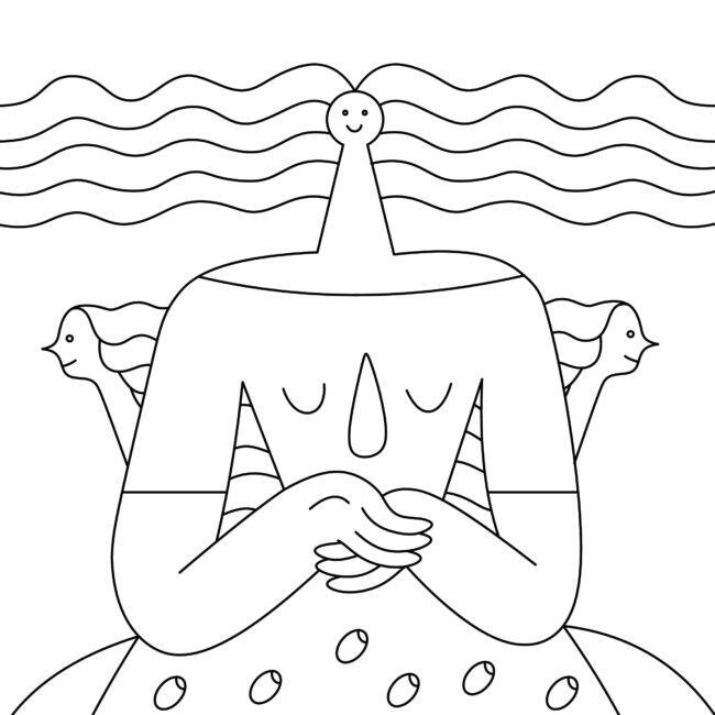
We created everything from scratch: an original logo, custom website illustrations, and a pattern system designed to translate colours and symbols into a cohesive and powerful visual language for her new website.
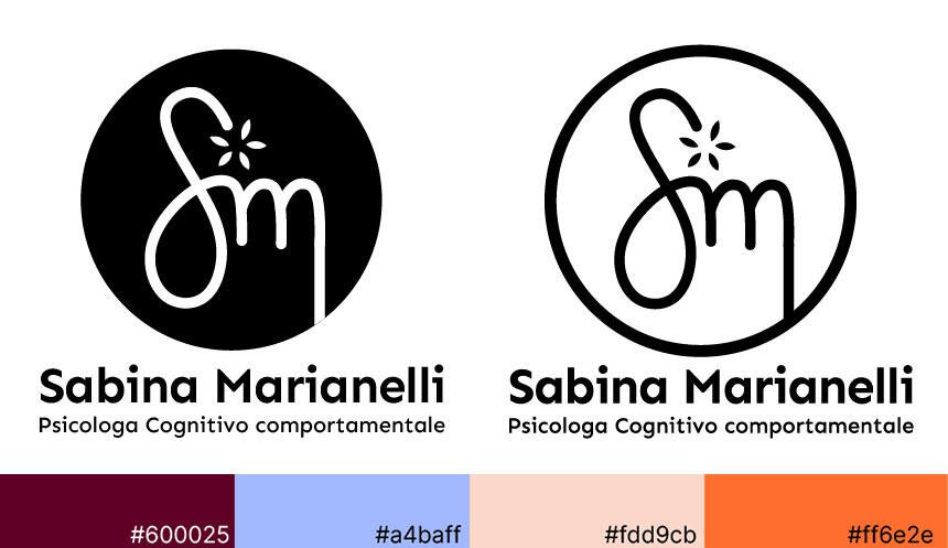
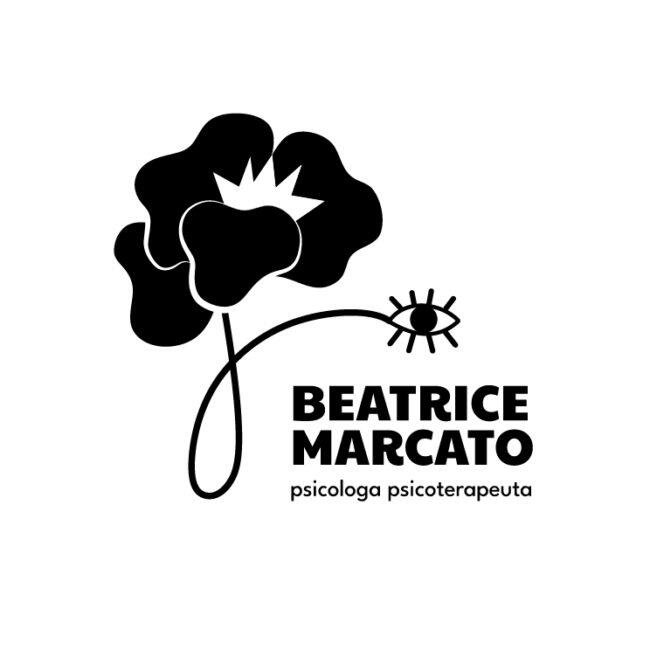
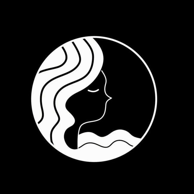
Logo concept
The logo originates from Sabina’s own signature, a personal gesture transformed into a mark. The initial letters of her name intertwine like thoughts that, over time, turn into awareness.
At the top of the “S”, a small element blossoms, symbolising renewal and openness. A slow, natural movement, like nature itself, which heals patiently and withstands storms before flowers emerge.
The message held within the mark is simple: giving yourself the possibility to grow.
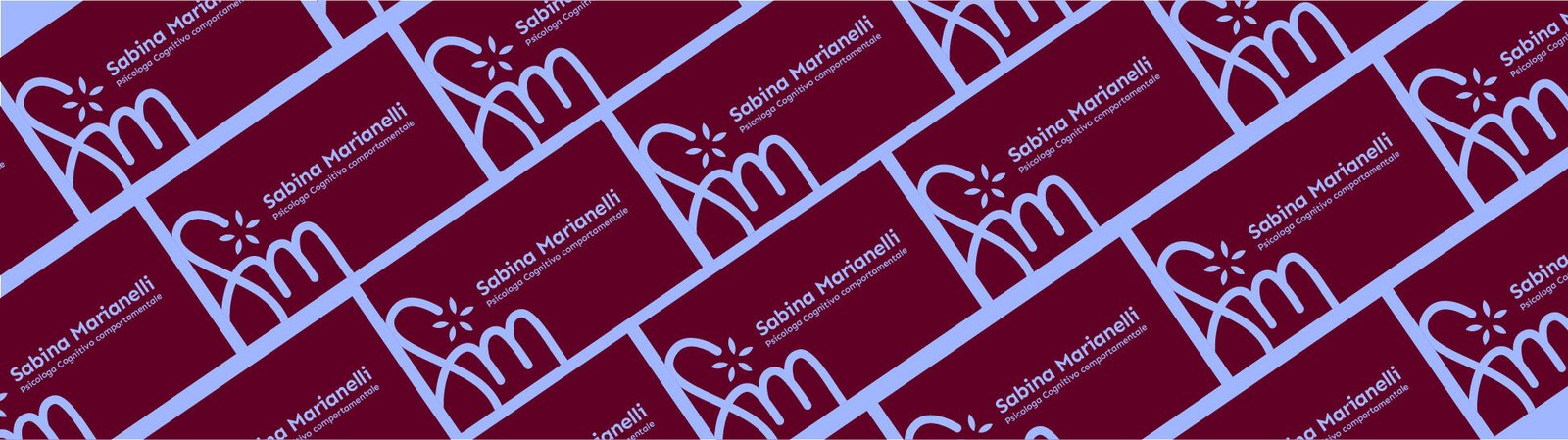
The element at the apex of the logo was then deconstructed to create a brand pattern, a visual motif that builds continuity across the website and allows for multiple variations. A clear and recognisable trace for those who encounter the brand.
Brand colors, typography, and illustrations
The chosen colors reflect the emotional and human path of therapy.
Burgundy welcomes and grounds, conveying stability and reassurance.
Light blue soothes and invites reflection, guiding a safe inner journey free from judgment. It is often used in healthcare environments to support focus and reduce anxiety.
Orange brings warmth and light, nurturing trust between therapist and client.
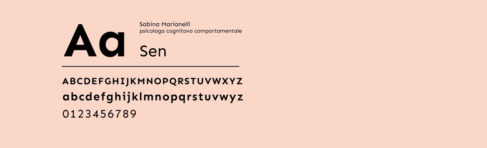
The selected typeface, a sans serif with subtle serif-like details and soft curves, suggests non-duality. In life, as in psychology, things are rarely just black or white. Opposites coexist within us, and growth emerges from that balance.
Thinking about a rebranding? We can help shape your website’s visual identity with custom illustrations and patterns. Coffee?
Google Analytics is a web analytics service provided by Google Ireland Limited ("Google"). Google uses the collected personal data to track and examine the usage of this website, compile reports on its activities, and share them with other Google services. Google may use your personal data to contextualize and personalize the ads of its advertising network. This integration of Google Analytics anonymizes your IP address. The data sent is collected for the purposes of personalizing the experience and statistical tracking. You can find more information on the "More information on Google's handling of personal information" page.
Google Tag Manager is a tag management service provided by Google Ireland Limited. The data sent is collected for the purposes of personalizing the experience and statistical tracking. You can find more information on the "More information on Google's handling of personal information" page.