Brand identity and logo design for travel designer
About
Working with Eugenia of Agape Viaggi felt like taking a journey within a journey. When we first created her logo as a travel designer, the focus was travel as a deeply lived experience. Over time, her brand evolved, and that vision naturally transformed into a specialisation in film tourism, particularly in the UK. The original brand identity proved strong enough to support this shift without losing coherence.
Today, Agape Viaggi turns travel into personalised experiences to be lived as if inside a film. The logo still stands firmly, because it continues to convey the core values of her brand. Each itinerary she designs invites travellers to rediscover the world with the same sense of wonder that cinema, art, literature, and storytelling can awaken within us.
#ff9a57
#ffd427
#ffeda8
#82c0ff
Logo concept and typography research
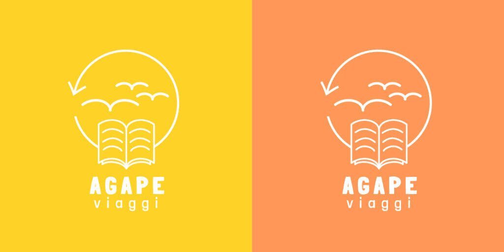
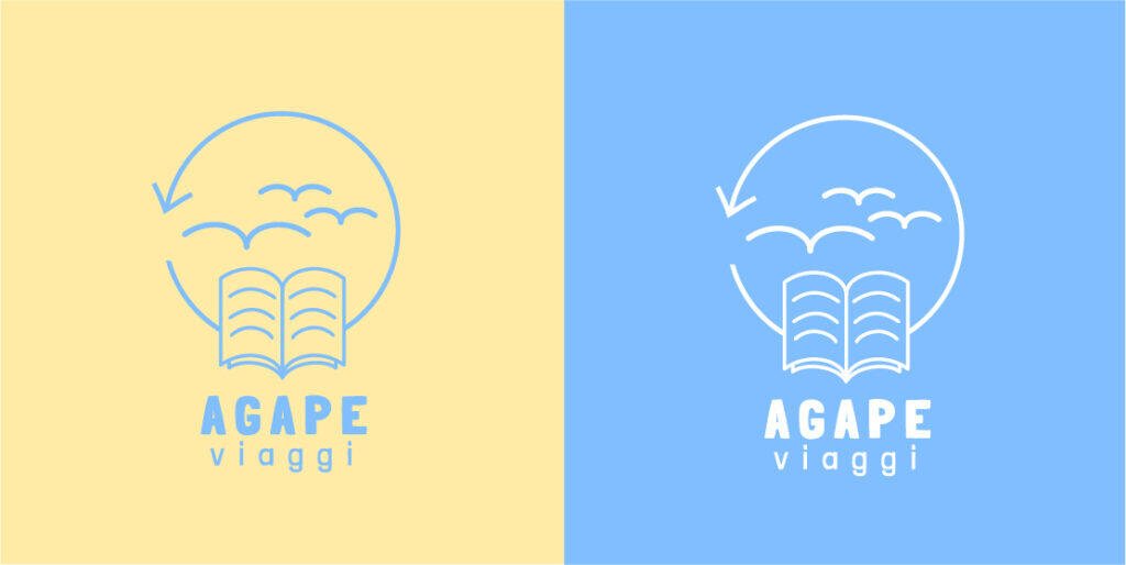
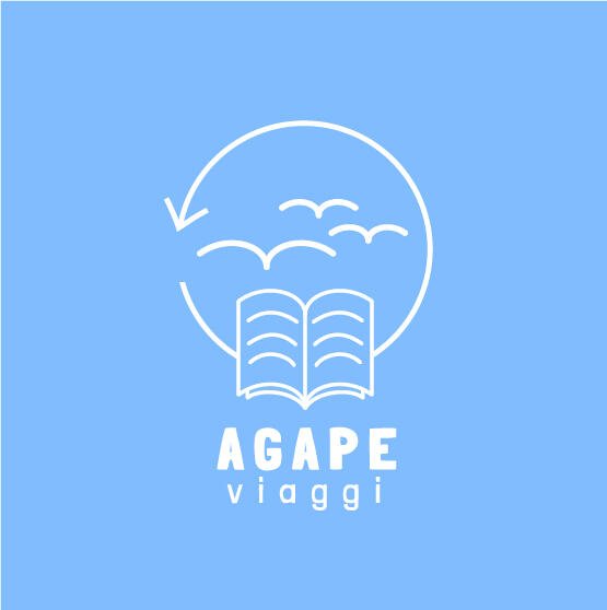
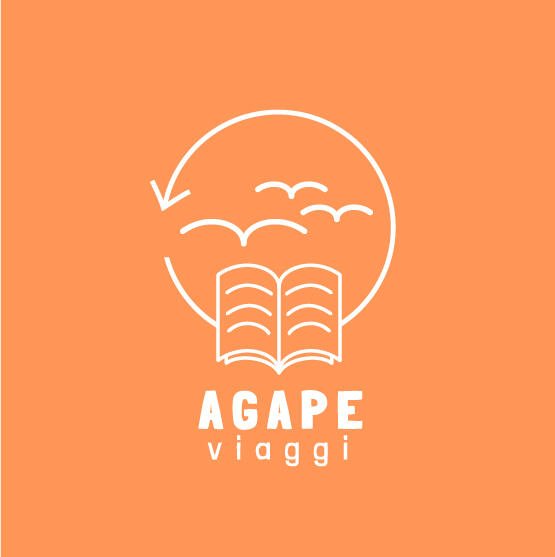
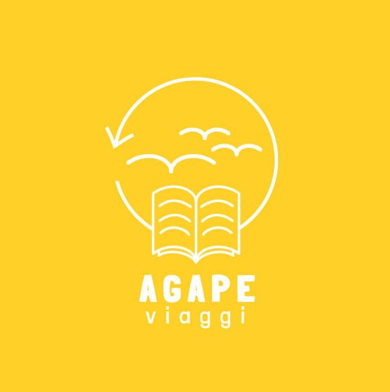
The concept draws directly from what Agape Viaggi represents: deep research, genuine passion, and a creativity that invites you to move beyond boundaries.
A book, symbol of knowledge, whose lines gradually turn into seagulls, a sign of freedom and vast spaces of imagination. A visual narrative of a journey that begins between pages and screens, where stories take shape before becoming lived experiences.
That journey unfolds into real travel, shaping new perspectives and opening wider horizons.
The arrow completes the circle: itinerary and culture intertwine, forming a cohesive and meaningful experience.
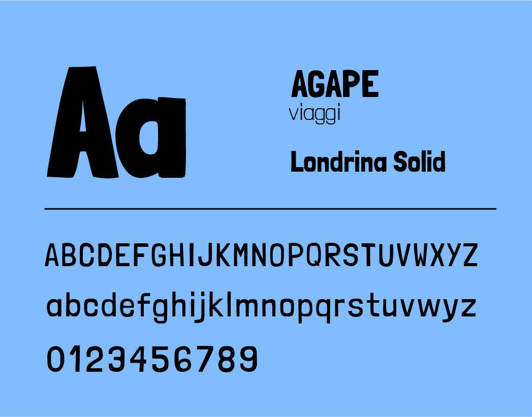
The carefully selected typeface, with its slightly irregular contours, speaks of inclusivity, uniqueness, and the value of difference.
Brand colors
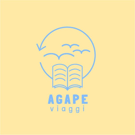
The brand colors of Agape Viaggi evoke a horizon of introspection. Orange ignites optimism, creativity, and a desire for connection, while blue opens towards an infinite sky, reassuring and contemplative.
Based on principles of Gestalt theory, these two colors find strength in contrast, bringing together complementary forces in a visual and emotional balance.
The color palette blends orange and blue like a sunset meeting a clear sky, vitality and openness held in the same frame.
Agape, the brand name, comes from Greek and means love. It derives from the verb agazomai, “to be in awe”. And that is precisely what Eugenia invites people to do: love, discover, experience, and travel with an open heart.
In Eugenia’s words
From the very beginning, Kristina was open, supportive, and able to make me feel at ease throughout every stage of the project. Her ability to listen, her empathy, and her professionalism, combined with Alessandra’s visual research, led to a logo that fully reflects what emerged in the first phase of building my brand identity and that truly feels like me.
Worried that your brand might evolve and your visual identity won’t keep up? As you’ve seen, that doesn’t have to be a problem. When a visual identity is built on solid core values, it grows with you. Shall we talk it through? We’d be happy to help.
Google Analytics is a web analytics service provided by Google Ireland Limited ("Google"). Google uses the collected personal data to track and examine the usage of this website, compile reports on its activities, and share them with other Google services. Google may use your personal data to contextualize and personalize the ads of its advertising network. This integration of Google Analytics anonymizes your IP address. The data sent is collected for the purposes of personalizing the experience and statistical tracking. You can find more information on the "More information on Google's handling of personal information" page.
Google Tag Manager is a tag management service provided by Google Ireland Limited. The data sent is collected for the purposes of personalizing the experience and statistical tracking. You can find more information on the "More information on Google's handling of personal information" page.