Vioma Travel Design is Kristina’s parallel project. Yes, she doesn’t sleep much. It creates authentic connections through tailor-made journeys in Greece, guided by a human-centered approach. By revealing culture, traditions, and gastronomy, each trip becomes more than an itinerary. It becomes a vioma, an experience that connects people, places, and emotions that linger.
Of course we took care of Kristina’s branding. Did you expect anything else? Strategy, brand naming, payoff, brand identity, website graphics, and copywriting. A full system, thoughtfully built from the ground up.
Take a look at the website to see how it all came together.
Brand naming concept
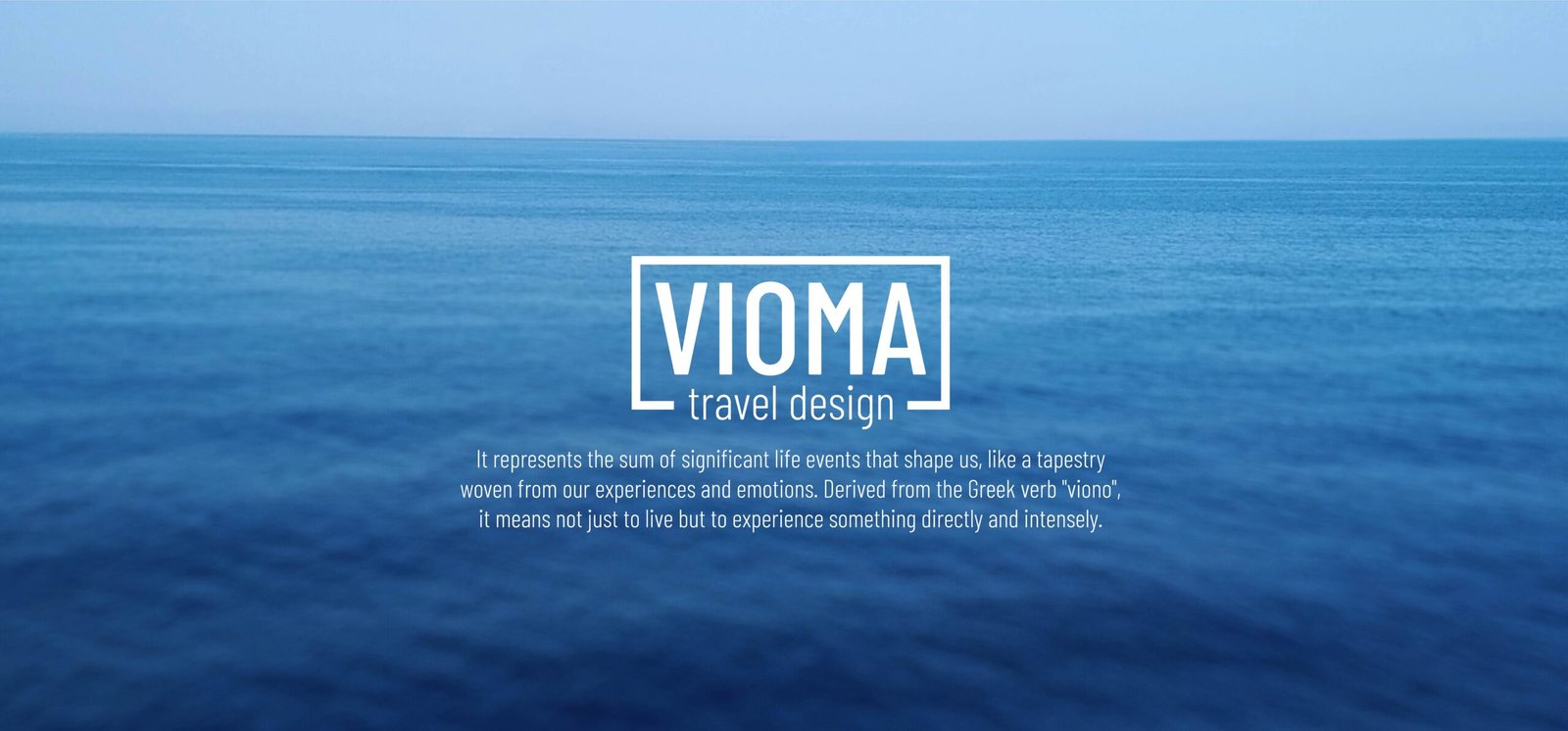
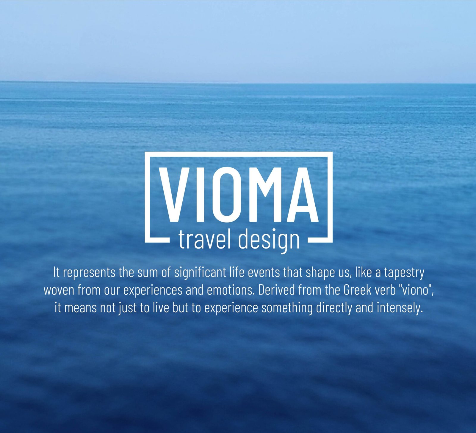
The brand name “Vioma” is a Greek word that cannot be translated precisely. It refers to the knowledge and awareness gained through defining moments in life, experiences that shape who we become.
It derives from the verb viono, meaning to live intensely and experience directly. Within the word lies vima, the Greek word for “step”, marking the rhythm of journeys and lived experiences. The name expresses the philosophy of Vioma Travel Design: transforming every journey into a vioma.
About
Vioma Travel Design is Kristina’s parallel project. Yes, she doesn’t sleep much. It creates authentic connections through tailor-made journeys in Greece, guided by a human-centered approach. By revealing culture, traditions, and gastronomy, each trip becomes more than an itinerary. It becomes a vioma, an experience that connects people, places, and emotions that linger.
Of course we took care of Kristina’s branding. Did you expect anything else? Strategy, brand naming, payoff, brand identity, website graphics, and copywriting. A full system, thoughtfully built from the ground up.
Take a look at the website to see how it all came together.
Brand naming concept
The brand name “Vioma” is a Greek word that cannot be translated precisely. It refers to the knowledge and awareness gained through defining moments in life, experiences that shape who we become.
It derives from the verb viono, meaning to live intensely and experience directly. Within the word lies vima, the Greek word for “step”, marking the rhythm of journeys and lived experiences. The name expresses the philosophy of Vioma Travel Design: transforming every journey into a vioma.
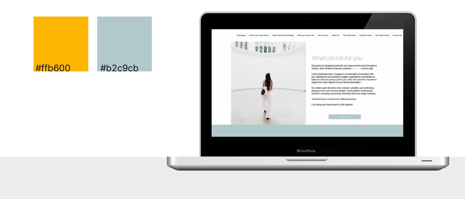
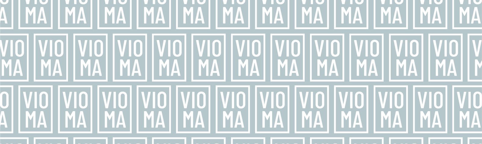
Logo concept and brand colors
Kristina did not feel represented by symbols, so we chose a typographic logo: refined, elegant, and adaptable, including a vertical version.
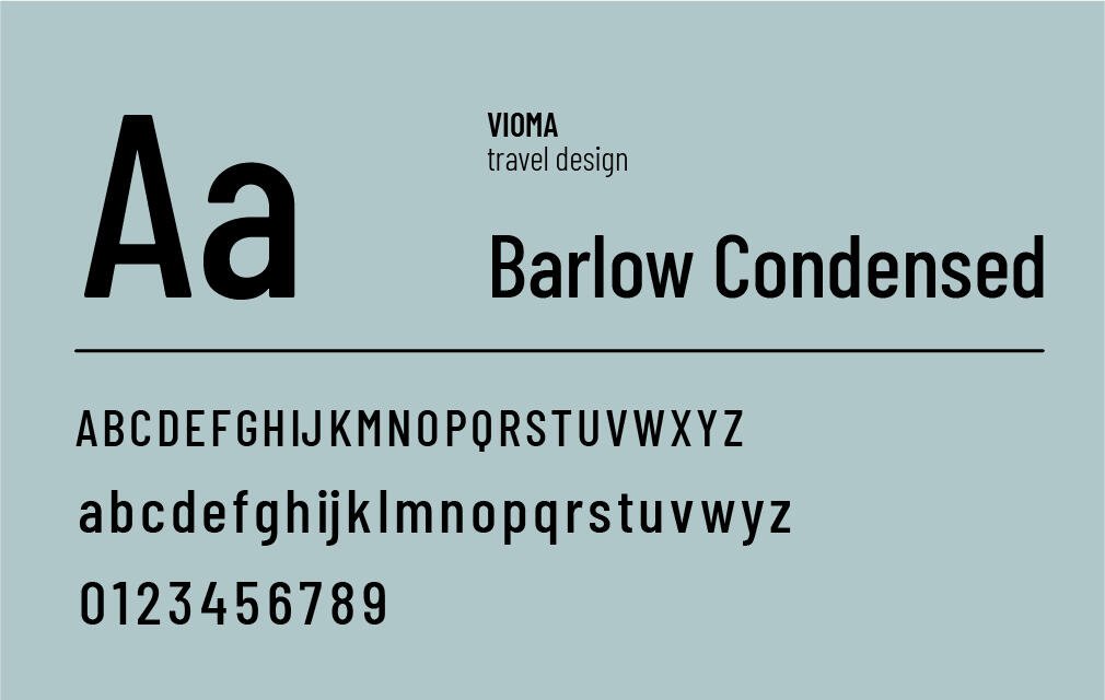
Light blue and grey tones evoke open skies and calm seas, suggesting travel experiences that are relaxed yet carefully curated. Clean lines and a sans-serif typeface communicate reliability and clarity.
The rectangular frame introduces structure while remaining open, symbolising tailor-made journeys that respect the traveller’s freedom. The lowercase “travel design” contrasts with the uppercase “VIOMA”, reinforcing a soft, essential, and elegant approach: the focus remains on the experience itself, without excess, but with care.
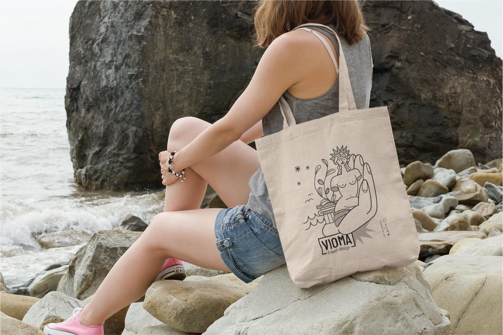
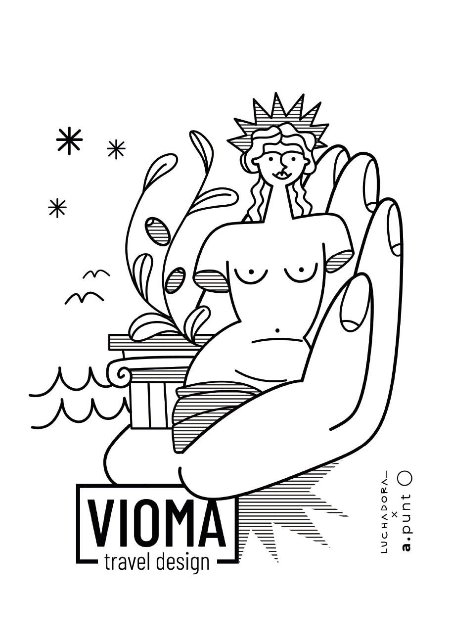
Brand illustration
The artist Luchadora interpreted Vioma as the possibility of holding Greece in your hands.
The concept comes to life through symbolic details: olive branches, sea, ancient art, and timeless architecture, expressions of a culture that is layered and magnetic.
Vioma Travel Design invites travellers to experience Greece, not simply visit it. Not a trip, but an encounter. A connection with the soul of a place. Light, like the star shining in the illustration, a constant guide for those seeking meaningful travel.
Have you ever thought about representing your brand through illustration? We’re here to build the full branding of your project. Let’s talk over a virtual coffee, somewhere above the clouds.
Google Analytics is a web analytics service provided by Google Ireland Limited ("Google"). Google uses the collected personal data to track and examine the usage of this website, compile reports on its activities, and share them with other Google services. Google may use your personal data to contextualize and personalize the ads of its advertising network. This integration of Google Analytics anonymizes your IP address. The data sent is collected for the purposes of personalizing the experience and statistical tracking. You can find more information on the "More information on Google's handling of personal information" page.
Google Tag Manager is a tag management service provided by Google Ireland Limited. The data sent is collected for the purposes of personalizing the experience and statistical tracking. You can find more information on the "More information on Google's handling of personal information" page.