We worked with Beatrice, a psychologist, on redefining her professional identity after more than twenty years of practice. A rebranding that started from listening and led us to clearly define what makes her work distinctive: a welcoming presence, empathetic support, and a deep respect for personal timing.
People come to Beatrice wanting to feel understood, listened to, and respected, as they begin a process of self discovery and learn how to treat themselves with greater kindness. She accompanies this process with care, supporting emotional integrity and inner vitality. Her way of working brings a sense of lightness and reassurance, gently guiding people toward greater confidence and ease.
Rebranding strategy
We developed a communication strategy, defining vision, mission, and value proposition. From there, we designed Beatrice’s new visual identity: a logo and a colour palette that reflect both the values of her practice and her role as a professional. We supported her in building a coherent and distinctive brand identity, designed for the field of psychology and wellbeing. A visual system shaped around people, time, and care, using a human-centered branding approach, without forcing it into labels.
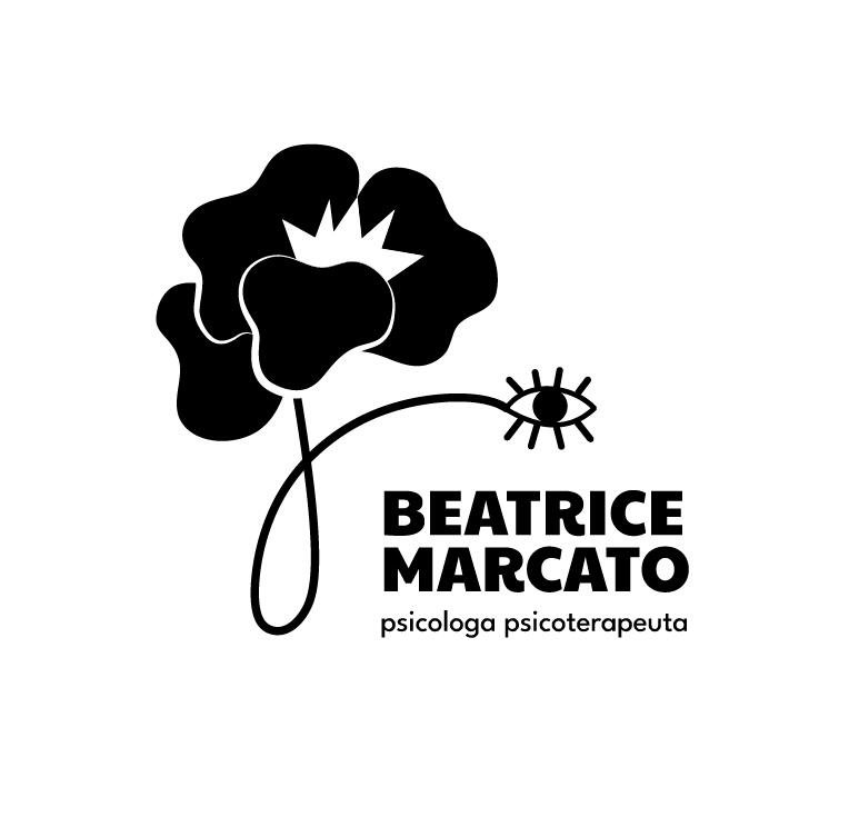
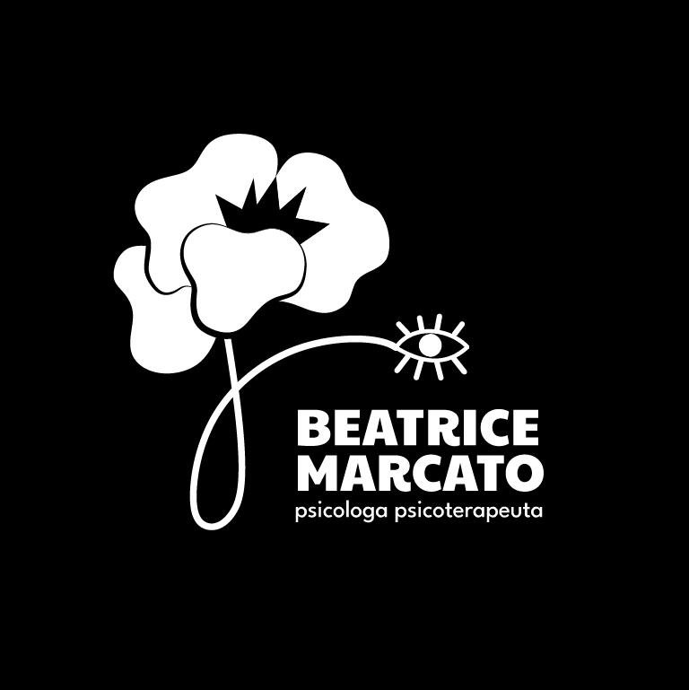
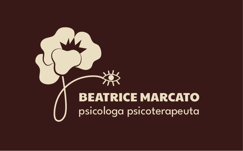
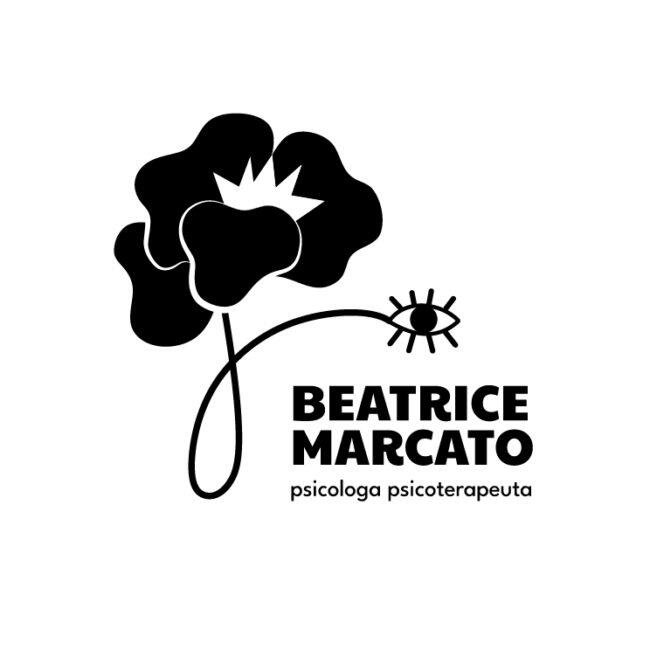
Logo concept
The poppy has an organic, full shape and begins from a seed: the start of everything. Its thorns are present, but they do not hurt.
The eye represents both this seed, as a symbol of change, and the act of observation: the ability to look at oneself from a new perspective, supported by the therapist. This eye can be read as Beatrice’s attentive gaze, or as the gaze of those who, through her work, finally find the courage to look inward.
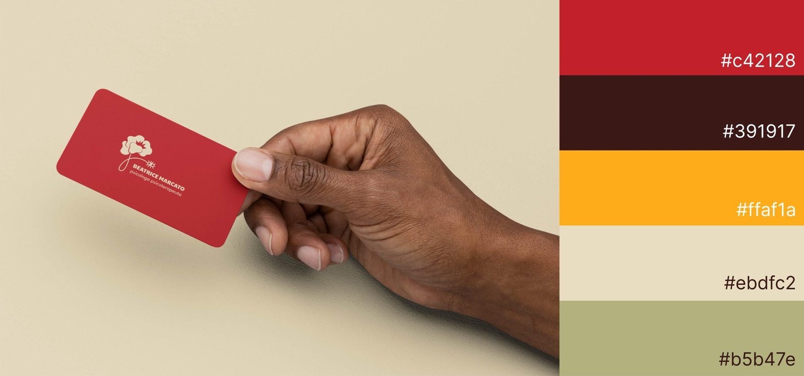
Brand values and colours
For the primary colour, we chose the natural red of the poppy: warm, welcoming, and vibrant, much like Beatrice’s approach.
According to psychologist Max Lüscher, red is one of the fundamental colours of the psyche, with an activating effect on the central nervous system. It is associated with strong emotions and connected to the root chakra, related to grounding and stability.
This colour reflects Beatrice’s gentle firmness and empathy, within a therapeutic process where people reconnect with their inner strength and beauty.
The core brand values that emerged are relationship, presence, and deep human exchange. Kind yet grounded, empathetic and clear, Beatrice accompanies her patients through a reparative and transformative experience, making life feel lighter and more liveable.
In Beatrice's words
Thank you from the heart for such a careful, thoughtful, and sensitive piece of work, able to capture even the smallest nuances and give them value. The logo was love at first sight, and it still is.
As Beatrice says, therapy is a dance for two: she’s the expert in psychology, and you’re the expert in your own story. We’re experts in branding and visual identity. You’re the expert in your brand’s story. Shall we dance?
Google Analytics is a web analytics service provided by Google Ireland Limited ("Google"). Google uses the collected personal data to track and examine the usage of this website, compile reports on its activities, and share them with other Google services. Google may use your personal data to contextualize and personalize the ads of its advertising network. This integration of Google Analytics anonymizes your IP address. The data sent is collected for the purposes of personalizing the experience and statistical tracking. You can find more information on the "More information on Google's handling of personal information" page.
Google Tag Manager is a tag management service provided by Google Ireland Limited. The data sent is collected for the purposes of personalizing the experience and statistical tracking. You can find more information on the "More information on Google's handling of personal information" page.