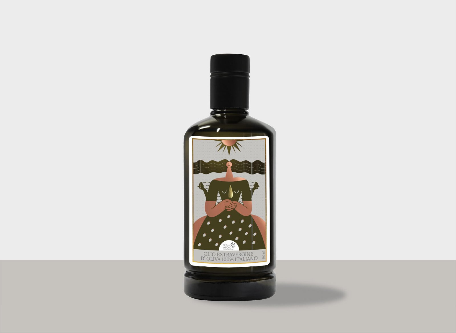
The olive oil card: a visual manifesto of feminine strength
Label design and original illustration for a premium olive oil
About
A packaging and illustration design project developed from a layered concept, developed through a human-centered design approach. Designing the label for a premium olive oil created by a collective of women meant giving visual form to a vision held in common. It meant telling the quiet, collaborative work of those who preserve tradition while innovating with respect.
By listening to stories, gestures, and words passed down through generations, we asked ourselves how to represent the invisible value of daily care, of the land, of the women who transform tradition into knowledge, and that knowledge into oil.
A visual communication project where label design, packaging, copy, and illustration come together as one narrative.
Concept label design
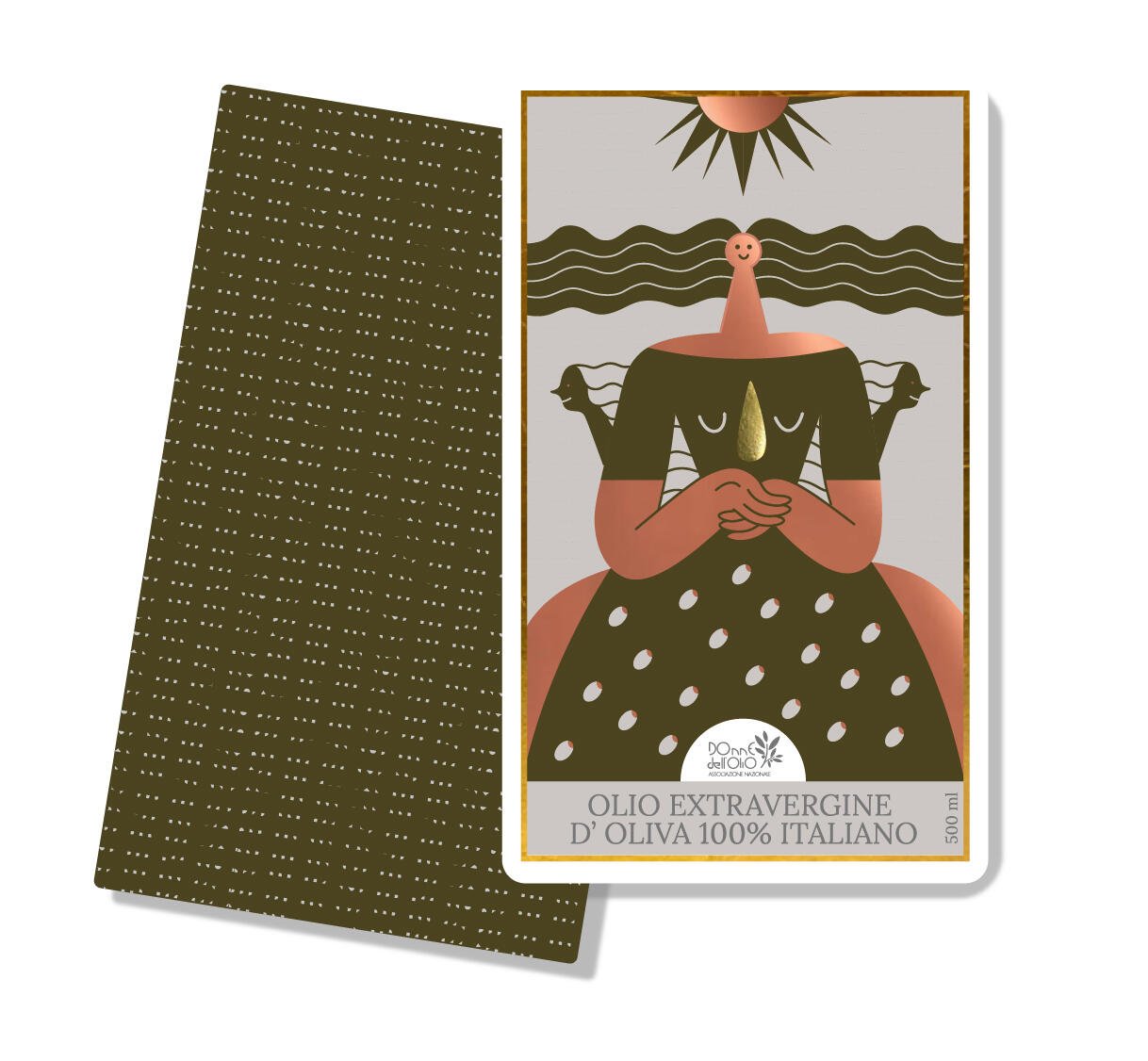
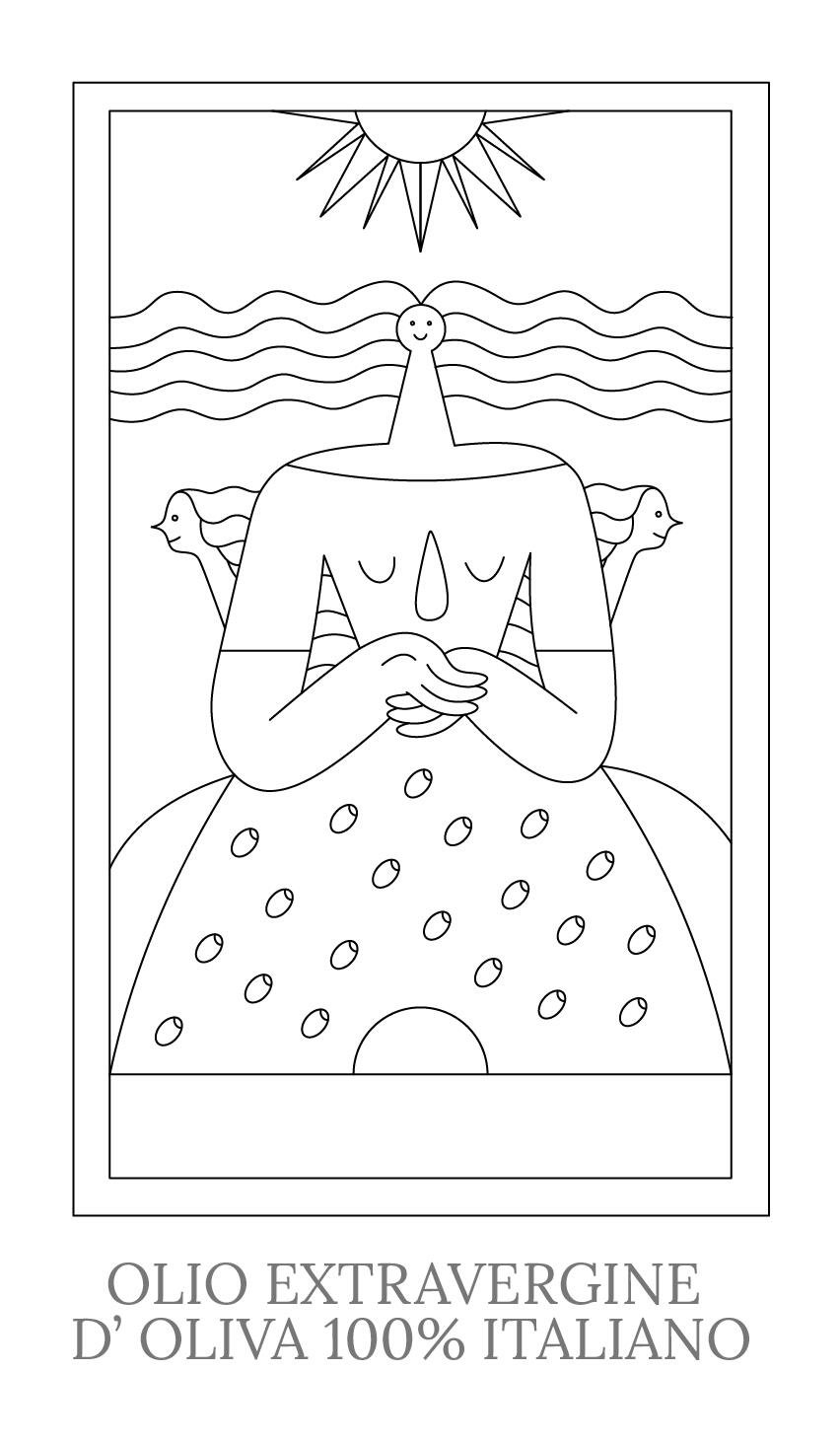
The illustration draws on tarot symbolism, where feminine archetypes embody transformation and power within society.
This label design speaks of a femininity that nourishes without possessing and brings people together without asking them to be the same.
It reflects generosity, care, and inner fluidity, a return to a sacred knowledge that should never be feared in women.
The label becomes a visual manifesto: a figure rooted in the earth like an ancient olive tree, carrying memory and wisdom.
Symbolism
The central figure: a symbol of emotional intelligence and inner strength, honouring a feminine knowledge that has never that has never faded, only gathering force before resurfacing.
The two figures: genderless, with hair flowing like oil and water, they represent connection, equality, and the dignity of difference.
The sun: a symbol of fulfilment and ripening. It suggests that true power lies in constancy, in the ability to slow down and allow transformation to unfold, just as it does in the pressing of olive oil.
The drop of oil: each drop carries a story of patience and dedication. It asks for a more conscious way of consuming and reminds us of the quiet value of something present in everyday life, too often taken for granted.
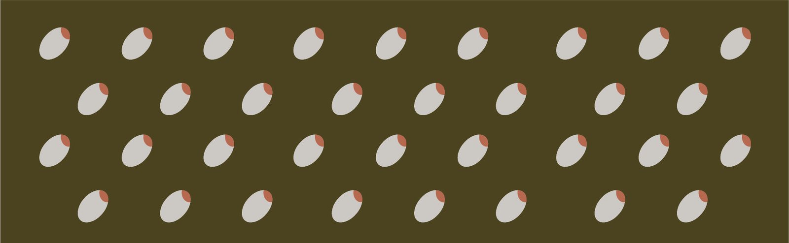
Material research and typography
In packaging, every choice, from paper to type, conveys intention. Values, style, vision are never neutral.
At the centre of the label, where the eye naturally settles, a tactile detail becomes a gesture: a shift in texture, finished with a subtle gloss relief, marking the moment of harvest. A drop of oil falling, then received. A simple yet essential symbol, that places the act itself at the heart of the design.
The transparent hair follows the contour of the glass, a line that gently connects form and material, inspired by the bottle’s distinctive shape and the horizontal indentation at its base.
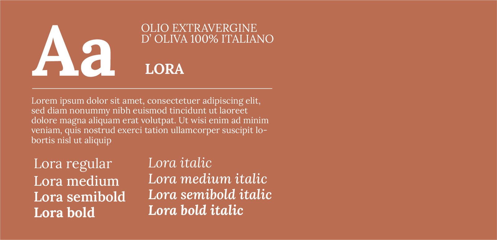
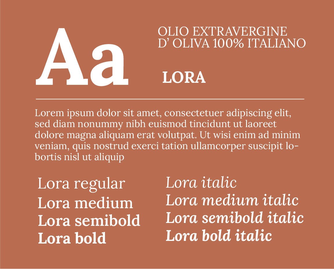
The chosen typeface, Lora, reflects a duality within the feminine: empathy and firmness. A contemporary serif balanced between grace and structure, with calligraphic roots. Its character bridges typographic heritage and a more modern, inclusive vision.
The label becomes a card
Transformed into an actual card, the label moves beyond its surface. It becomes a tangible piece of visual communication, something to hold, to turn, to keep. A small object that captures attention and invites curiosity.
Changing the format opens the door to a broader narrative, where packaging is no longer just there to contain, it becomes part of the story.
If you want your packaging and label design to do more than sit on a shelf, we should talk.
Google Analytics is a web analytics service provided by Google Ireland Limited ("Google"). Google uses the collected personal data to track and examine the usage of this website, compile reports on its activities, and share them with other Google services. Google may use your personal data to contextualize and personalize the ads of its advertising network. This integration of Google Analytics anonymizes your IP address. The data sent is collected for the purposes of personalizing the experience and statistical tracking. You can find more information on the "More information on Google's handling of personal information" page.
Google Tag Manager is a tag management service provided by Google Ireland Limited. The data sent is collected for the purposes of personalizing the experience and statistical tracking. You can find more information on the "More information on Google's handling of personal information" page.